The Psychology of Color: How Paint Affects Mood and Home Atmosphere
When designing your home, choosing the right paint color goes beyond aesthetics—it shapes the way you feel in each space. The psychology of color plays a crucial role in setting the mood, energy, and overall atmosphere of a room. Whether you're aiming for a calm retreat, a vibrant gathering space, or a cozy sanctuary, your color choices influence daily emotions and interactions.
Let’s explore how different colors impact your mood and how you can use them to create the perfect ambiance in your home.


Warm Colors: Energizing & Inviting
Red – Passion & Energy
Red is bold, powerful, and stimulating. It increases energy levels and heart rates, making it an excellent choice for dining rooms, kitchens, or entertainment areas where lively conversation and activity thrive. However, using too much red in a bedroom may feel overwhelming, so consider using it as an accent.
Best For: Dining rooms, kitchens, accent walls
Use Sparingly In: Bedrooms, small spaces
Yellow – Happiness & Optimism
Yellow evokes warmth, positivity, and brightness. It mimics sunlight, making rooms feel welcoming and cheerful. It’s perfect for kitchens, breakfast nooks, or entryways but should be used carefully in bedrooms, as bright yellows may be overstimulating.
Best For: Kitchens, hallways, sunrooms
Use Sparingly In: Bedrooms (opt for softer yellows if used)
Orange – Warmth & Social Connection
Orange blends the energy of red with the happiness of yellow, making it a great choice for exercise rooms or social spaces. It encourages conversation, enthusiasm, and warmth but can feel overpowering in large doses.
Best For: Home gyms, playrooms, creative spaces
Use Sparingly In: Bedrooms, formal living rooms


Cool Colors: Calming & Relaxing
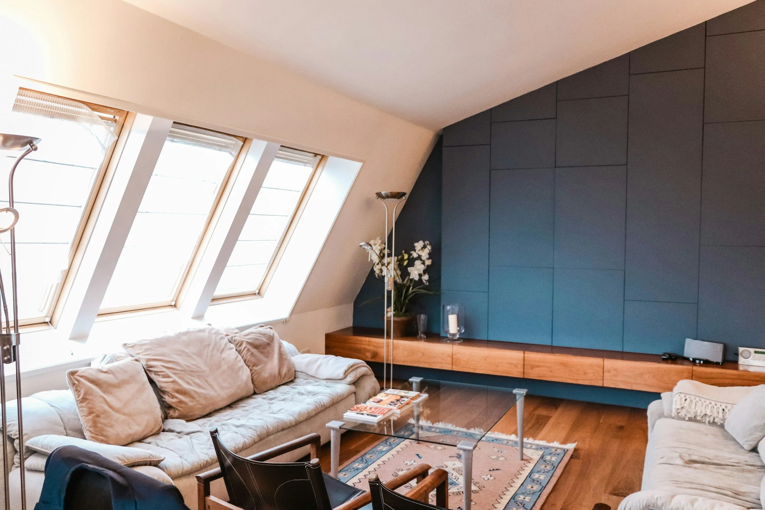
Blue – Serenity & Focus
Blue is one of the most calming colors, promoting peace, clarity, and concentration. Lighter blues are perfect for bedrooms and bathrooms, creating a spa-like effect, while deeper blues bring depth and sophistication to offices or formal spaces.
Best For: Bedrooms, bathrooms, home offices
Use Sparingly In: Kitchens (may suppress appetite)
Green – Balance & Renewal
Green represents nature, tranquility, and growth. It’s one of the most versatile colors, working well in almost any room. Soft greens create a soothing environment, while deeper greens bring a sense of richness and grounding.
Best For: Living rooms, bedrooms, offices
Use Sparingly In: No major restrictions—green is universally welcoming
Purple – Creativity & Luxury
Lighter shades like lavender bring a sense of calm, making them perfect for bedrooms. Deep purples, like eggplant or plum, evoke luxury and creativity, making them ideal for statement walls or elegant spaces.
Best For: Bedrooms, creative spaces, accent walls
Use Sparingly In: Large living spaces (dark purple can feel heavy)


Neutral Colors: Timeless & Versatile
White – Clean & Fresh
White symbolizes simplicity, cleanliness, and brightness. It’s perfect for small spaces to make them feel larger and airier. However, stark white can feel cold, so opt for warmer off-whites or creamy tones for a cozier effect.
Best For: Any room needing brightness and openness
Use Sparingly In: Rooms with little natural light (may feel sterile)
Gray – Sophisticated & Modern
Gray offers elegance, neutrality, and a modern touch. Light grays provide a subtle, airy feel, while charcoal grays add depth and drama. It’s an excellent backdrop for colorful décor.
Best For: Living rooms, offices, bedrooms
Use Sparingly In: Rooms with little light (dark gray may feel heavy)
Beige & Taupe – Warm & Cozy
Beige and taupe bring warmth and a sense of comfort. They’re ideal for traditional or modern homes and pair beautifully with natural textures like wood and stone.
Best For: Living rooms, dining rooms, hallways
Use Sparingly In: Areas needing contrast (too much beige can feel bland)
Choosing the Right Colors for Your Home
When selecting paint colors, consider:
How you want to feel in the space – Energized? Relaxed? Cozy?
The room’s natural lighting – Dark colors absorb light, while lighter shades reflect it.
Furniture and décor – Choose colors that complement existing pieces.
Room size – Lighter colors make spaces feel larger; darker shades create intimacy.
Ready to Refresh Your Space?
At DSJ Painting, we specialize in helping homeowners choose the perfect colors to enhance their home’s atmosphere. Whether you’re looking for a bold statement wall, a calming retreat, or a luxurious finish, our expert team can bring your vision to life.
Call us today for a free consultation. Serving West Chester, PA & surrounding areas. Get a Quote Now!